7 Landing Page Styles That Work With Paid Advertising
The success of your paid advertising campaigns has less to do with the ad itself and more to with what happens after the click.
You can have the most persuasive ad copy, that perfect “eyeball grabbing” image and buy the highest quality traffic… yet if your landing page is poorly designed for paid traffic, then you’re going to have a really hard time achieving a positive ROI.
We’ve found 7 different styles of landing pages that are working very well for advertisers who drive millions of dollars worth of display traffic to their site every year.
In this post we’re going to cover what they are, who’s using them and why they work. You’ve probably seen some of them, but I guarantee there are one or two that will be new for most people.
Landing Page #1: Is it a Landing Page or an Article? It’s an “Article Lander”
One “new” type of landing page is the “article lander”. This is usually a presell page that looks like a news article, scientific study, press release or a blog article. They can be multiple pages (like the “Old School New Body” sales funnel we analyzed in the “Business of Display Part 4: Info Products” post) or they can be single page landers like the examples below.
These tend to work well because they don’t raise most peoples’ “Sleazy-Marketer-Wants-My-Money” flag. People have started to become blind to traditional sales letters, video sales letters or anything that indicates that someone wants them to buy something. An article lander just looks like an informational article.
One successful supplement advertiser — “Force Factor” — is using an article lander as a presell page for their natural testosterone boosting supplement “Test 180x”.

The article lander presells the customer on the benefits of this “new supplement” without immediately raising any alarms. Once you read the article you’re going to be more receptive to actually finding out more about the product, especially when it comes with a free trial.
The headline “New Testosterone Booster Hits The Shelves” is written like the headline from a news article or press release. There’s a logo at the top which says “Scientific Innovations” making it appear like it’s coming from a scientific journal. The body copy is written in the style of a news article with a slight sales twist.
Moral of the story: it doesn’t scream “advertisement”.
Article landers are also easy to A/B test. All you need to do is change the text on the page. A video sales letter, for example, requires you to re-record the audio, re-record the video, reformat the video, upload the new video, etc.
In addition, it’s easy to find the bottleneck in your funnel if you’re using a multiple page article lander. You can easily uncover which page causes the highest number of users to exit the page. For example, if you notice that a lot people drop off on page 3 of 5 in the article sequence, you now know there is an issue with page 3 and can start to brainstorm ways to improve that specific page and NOT the entire sequence.
Landing Page #2: From Print to Digital — The Advertorial
Advertorials (also known as “Native Advertising”) were the hottest new landing page in 2014. They were even featured on an episode of Last Week Tonight with John Oliver.
These are the internet version of ads direct response marketers have been using for years in newspapers and magazines.
One of the best old school marketers who commonly used these ads was Gary Halbert. In one issue of his “Gary Halbert Letter”, he writes:
Make Your Ad Look Like A News Story
Here is how to “think” about your newspaper ads. Think about what could be the best possible piece of luck you could have. Think about a reporter who heard a rumor about your product or service and decided to check it out. And then, he fell in love with it. In fact, he loved it so much, he went back to his typewriter and wrote a full-page rave article about what you are selling.
Here’s an example of an old school advertorial selling a new fishing lure:

Advertorials are very similar to article landers. The small difference is that Advertorials are always made to look like news stories and are written in a more “newsy” style. Article landers can be written in this style, but it’s not a hard-and-fast rule. Article landers also tend to be hosted on the company’s domain. Advertorials are often found on “Advertorial Portals” like HealthHeadlines.com, HowLifeWorks.com and FirstToKnow.com. These sites buy display traffic and send it to advertorial content that contains an affiliate link.
Here’s a great example of an advertorial for a probiotic health supplement on HowLifeWorks.com:

Here’s another example from LowerMyBills.com

Both advertorials educate the consumer the way a news article would BEFORE they pitch the product . The Probiotic advertorial explains what a Probiotic is and why it’s beneficial. The Lower My Bills advertorial teaches you about a new government program called “HARP”, which was created help homeowners refinance their mortgages and save money.
Advertorials can work very well at building trust as a presell page in just about any market.
Landing Page #3: Tell Me About Me — The Quiz/Survey Landing Page
Over the past couple of years more and more marketers have been using quiz and survey landing pages. They’re a bit more complex to set up, but they work very well with cold traffic (we’ve seen the results first hand).
Basically, an advertiser sends traffic to a landing page where the prospect uses a quiz to figure something out about himself/herself.
Why they can’t lose weight…
The acidity level of their body based on the foods they eat…
The problem with their golf swing… etc.
The acidity level of their body based on the foods they eat…
The problem with their golf swing… etc.
There are 3 reasons why these work:
- Again, it’s not obvious it leads to a sales pitch.
- If done right, the information that you’ll receive is tailored to your specific needs. It’s not a pre-packaged solution meant for everyone under the sun. It’s for YOU.
- People crave to know more about themselves and why they suffer from certain problems. This is why Cosmo quizzes, BuzzFeed quizzes and the daily horoscope are so popular.
Here’s a great example from AlkalineFoods.net, a site that sells products related to the Alkaline diet (a diet based on the premise that the cause of many health issues are due to high acidity levels in your body).
The landing page is very simple and just has a call-to-action to take the quiz.

You then take a 6 question survey. Like a multi-page article lander, you can see where people drop off and fix that specific question. Sometimes people will exit the page if they find the question too “difficult”. The theory being that they’d rather quit the survey than answer the question wrong (even if there are no wrong answers).

They eventually ask you for your name and email so they can send you the link to your report (getting you to opt-in to their list in the process)

Then you’re given the report itself on the next page (without having to check your email)

At the bottom there’s a link to a video “The 5 Super Foods” which is a VSL for “Energize Greens”, a natural greens supplement.
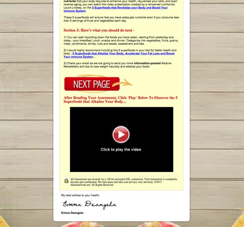
Even though they eventually try to sell you a product, they’ve already built trust with the quiz + report on your body’s acidity levels. You’re more likely to trust them AND buy their product as they’ve already given you valuable information that can help with your health.
Landing Page #4: WARNING… it’s the Video Sales Letter
The video sales letter (or “VSL”) was created/made popular by marketer Jon Benson. He created the first “ugly” video sales letter for his diet book, “The Every Day Diet”.
Over the years they’ve gotten more and more advanced with some people spending thousands of dollars on copywriting and production, but the majority of people still do it the “ugly” way: words on a powerpoint being read out loud.
The advantage to using a VSL is that prospects don’t have to read. We live in an entertainment based society and most people prefer to watch videos than read text. Plus, the video format forces them to listen to your sales message. They can’t scroll down and look at the price of the product like a traditional sales page. They have to wait until they get to the end of your video, after you’ve already had time to sell them on the benefits of your product. When you do a good job, the price becomes irrelevant.
One of my favorite VSLs at the moment comes from Perfect Origins, a nutraceuticals company that specializes in weight loss and probiotic supplements:

Landing Page #5: The Lead Generation Page
Display is a great source of traffic for advertisers doing lead generation.
One of the biggest lead gen advertisers is “Lower My Bills”, which does lead generation for auto insurance, life insurance, mortgage refinancing and more.
Here’s the landing page for their car insurance offer:

Very simple and very friendly looking. The language at the top (“No login required, compare rates!”) immediately breaks down the “Anti-Sales” defenses of most of your prospects.
You then input all the relevant details needed for them to find auto insurance offers in your area.
Given that they’re legitimately helping you, you know that the information is going to be tailored to at least your location. Once you make it past the landing page, you fill out even more questions so their software can narrow down the insurers that are right for you.
Eventually you enter your email and they’re able to send you offers through email marketing.
Very simple, very effective landing page style.
Landing Page #6: Just Give It To Me — The Simple Sign-up/Opt-in Page
The more straight forward your offer is, the more simple your landing page can be.
For example, Equifax.com is one of the leading credit report companies.
There’s not a whole lot to explain about credit reports. People know what they are and just want to know where to get them for a good price.
The landing page below tells them exactly what they’re going to get, the terms behind a deal and a simple opt-in form and call-to-action.

Landing Page #7: Thou Shall Not Enter — The Gated Landing Page
Everyone knows the importance of building up an email list. But building up a list is doubly important if you’re running an eCommerce store.
When a user comes from a display ad to an eCommerce store, they’re likely going to get caught up browsing the products. If they end up NOT buying something, they’re probably just going to exit the page, not bother to opt-in in the small section on the right and then completely forget about your eCommerce store.
One way that eCommerce stores have solved this is by creating a “gated” landing page. This means that the prospect is required to enter their email address before they’re able to browse the products.
Here’s an example from Zulily, a huge eCommerce store that sells discounted clothing and items for your house.

There’s definitely going to be a percentage of people that get angry and just exit the page.
However, the “Daily Deals Up To 70% Off!” copy is pretty tempting and most people are going to be willing to opt-in just based on that.
Another eCommerce which uses a gated landing page is Frank & Oaks, an online menswear store.

They’ve chosen to go the “premium” route and make it feel like an exclusive club, as opposed to Zulily’s strategy of offering great deals. Plus, all the logos at the bottom are great social proof. Most people are going to see these and trust them enough to enter their email.
Conclusion
Your landing page is one of the most important components in getting paid advertising to work. All 7 of these are proven page types that work depending on your offer and your audience.
No comments:
Post a Comment